Dashboard Usage
Every dashboard records when it was last opened and how often, so a dashboard nobody reads can be told apart from one the whole company depends on — before anyone changes or retires it.
The figures are on the dashboard's card in Settings → Dashboards. The header shows when the dashboard was Created and Last updated, when it was last Accessed, and how many times it has been opened in the last 30 days. The dashboards list carries the same two figures in its Last Accessed and Usage columns, the latter with a bar so the quiet dashboards stand out while scanning.
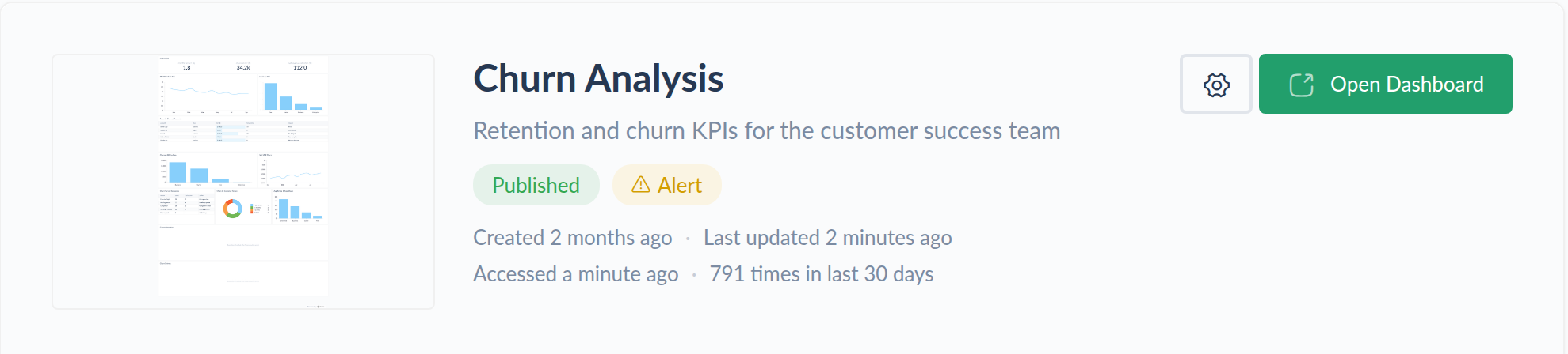
The access count always covers the last 30 days, whatever retention your plan allows. The chart below it is where longer history lives.
Activity chart
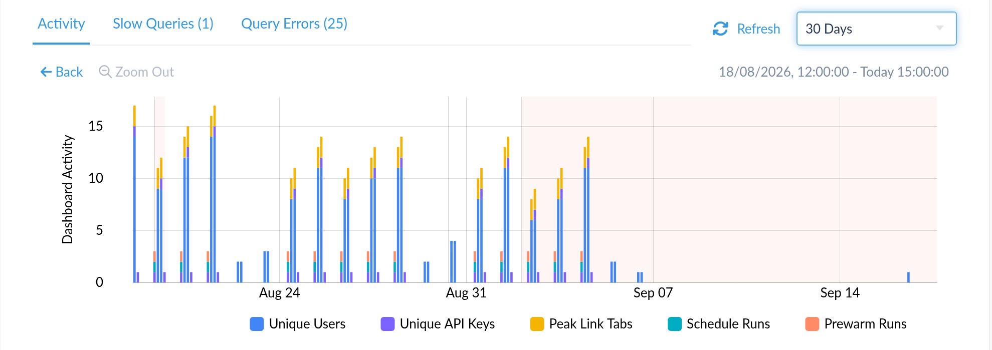
The card's Performance & Insights tab opens on Activity: a stacked bar chart of everything that has been touching the dashboard, in five series.
| Series | What it counts |
|---|---|
| Unique Users | distinct signed-in users who opened the dashboard in that interval |
| Unique API Keys | distinct API keys that requested it |
| Peak Link Tabs | the highest number of sharing-link tabs open at once, in the busiest minute of that interval |
| Schedule Runs | whether a scheduled e-mail ran |
| Prewarm Runs | whether a prewarm ran |
The five do not share a unit — two are distinct-principal counts, one is a peak, and the last two only indicate that a run happened — so read the stack as a rough composite of activity rather than as a total of anything.
Reading the series apart matters for the question the chart usually gets asked. Schedule and prewarm runs keep a dashboard's data warm without anyone looking at it, so a dashboard whose activity is all schedule runs is one that nobody opens.
The time range selector sits above the chart, alongside Refresh. The
30 Minutes and 60 Minutes ranges carry a LIVE badge and refresh
themselves. Dragging across the chart zooms into that interval; Zoom Out and
Back walk the selection outwards again.
How far back it goes
Access tracking, and how much of it is kept, depend on your plan (see Plans Comparison). Where the plan includes no access tracking, there is no Activity tab.
Otherwise the range selector offers presets up to your plan's retention and hides the rest. All Time, which reaches back to the dashboard's creation, appears only on plans whose retention is unlimited; those plans also collapse the preset list to the round numbers — 30 minutes, an hour, 24 hours, 7 and 30 days, 90 days, a year — with everything in between still reachable by zooming.
Query performance data is kept for 30 days regardless. Select a range longer than that and the completed-query and performance charts are replaced by a note saying so, the Slow Queries and Query Errors tabs are disabled, and the access chart continues to render across the whole range at one-day granularity. See Monitored Dashboards for what those two tabs contain.