Bar Chart
A bar chart displays numeric column values as horizontal or vertical bars in an X/Y coordinate system.

Data Requirements
The bar chart is available if the query results contain at least 2 columns, with at least 1 of them being numerical. The values of each numerical column can then be plotted as horizontal or vertical bars for each X coordinate / label. For example, a query result such as
| label | value1 | value2 |
|---|---|---|
| a | 1 | 5 |
| b | 5 | 2 |
| c | 3 | 7 |
produces the following bar chart with the label column values used for the X axis
and value1 and value2 column values on the Y axis. Each Y axis value is
shown as a bar sized according to the magnitude of the value.


Interactive Features
Tooltips
When hovering the cursor over a bar chart, a tooltip for the value is shown.


Configuration
The following visual configuration options are available for the bar chart and apply to all plotted bars:


- S, M, L, XL: Preset size options for the axis labels and tooltips.
- Vertical, Horizontal: Whether to use horizontal or vertical bars. Note that the axis are swapped with horizontal bars, i.e. a horizontal Y axis and a vertical X axis.
- Sparkline: Renders all bars as "sparklines", i.e. without a visible coordinate system.
- Tilt X Axis: On a vertical bar chart, the X axis labels can be tilted by 45 degrees, which can be especially useful for longer labels.
- Legend: Whether a legend should be displayed next to the chart, which can be a visual aid when plotting multiple bars.
- Tooltip: Enables or disables tooltips when the cursor hovers over the chart.
- Highlight negative: Whether negative values should get special visual highlighting.
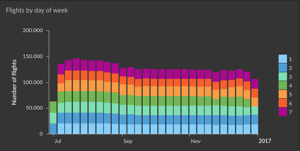
When multiple columns are used for Y axis values, i.e. there is more than one bar for each X coordinate, those Y values can optionally be stacked, either as absolute values, or as percentages.


Settings
The column configuration for a bar chart determines which columns are used for the X and Y axis of the chart. Only one column (which does not need to be numerical) can be used for the X axis, whereas any number of numerical columns can be used as Y axis values (i.e. as bars).


By default, all columns used for the Y axis are interpreted as values on a single Y axis. If there are two or more columns used with the Y axis, one of them can be configured to use a secondary Y axis, which is useful if the magnitudes of the values are on a different scale (or unit).
- Cumulative: If this option is enabled, the values of the column are cumulative.
- Trend: With only a single column used for the Y axis values, this option can be enabled to show a "trend line" of the values.
- Line: If two or more columns are used for the Y axis values, this option can be enabled on one or more of these columns to render them as a smooth line instead of bars. This is useful to overlay a bar chart with closely associated data points.
X Axis Options
The following options are available for configuring the X axis:


- Axis title: Whether the axis should have a title, which defaults to the column name. A custom title can be entered when the option is enabled.
- Automatic Date axis: If the column values are date/time values, this option is available and enabled by default. If enabled, Cluvio tries to create an evenly distributed time line, even if there are gaps in the data points.
- Bars Width: Configures the thickness of the bars. With 100% width, there are no gaps between the bars on the X axis.
- Max label length: The maximum length of length of the X axis labels (if they are textual, which is the common case).
Y Axis Options
The following options are available for configuring the primary and secondary (if present) Y axis:


- Axis title: Whether the axis should have a title, which defaults to the column name. A custom title can be entered when the option is enabled.
- Logarithmic: Whether the values on the Y axis scale should be interpreted as being logarithmic rather than linear (the default).
- Zero-based: Whether the scale should start at 0, rather than at the value of the smallest data point.
- Money: If the data points represent monetary values, this option can be enabled (and a currency chosen) to include currency symbols on the Y axis labels.
- Round: Enables rounding of values to a desired precision, if the values are not integers.
- Percents: If the data points represent percentages, this option can be enabled to include %-signs on the Y axis labels.
- Min, Max: Configures fixed minimum and maximum values for the axis.
- Invert axis: Inverts the axis and as such the plotted bars.
Additional Options
The following additional options are available for a bar chart:
- Tooltip for single value only: If multiple Y value columns and thus multiple bars are plotted and tooltips are enabled, the default behavior is to show tooltips for all Y values (bars) simultaneously that have the same X coordinate. If this option is enabled, only the tooltip of the data point (bar) whose center is closest to the cursor is shown instead.
Legend
If a legend is enabled, its position and maximum length of the labels can be configured.


Labels
As an alternative or in addition to tooltips, the option Show value labels can
be enabled to show either the X or Y value of a data point directly on the
chart at the desired position.


Colors
The Colors section of the chart configuration can be used to customize the
colors for each column used as a Y axis, i.e. for all bars representing values
from the same column. When the color is set to Automatic
(indicated by a grayed-out A), a color is selected from the dashboard color
scheme automatically.


Drill-down
A drill-down can be configured for the bar chart, so that when clicking on a bar a filter value is applied on the same or a different dashboard.


Use Navigate to to select the target dashboard of the drill-down action.
If the target dashboard is not the same dashboard that the bar chart is on,
the UI navigates to the chosen dashboard.
In the Apply filters section, select one or more filters from the target
dashboard and for each a column whose value should be applied to it
when the user performs the drill-down.