Chart Types
Each report in Cluvio is visualized with one of the supported chart types. The chart type for a report's query results is chosen in the report editor, with each chart type having its own set of configuration options.
When you run a query and choose a chart type, Cluvio automatically assigns columns from the result a semantic meaning in the chart to offer a useful default visualization, which you can then customize further.
Table Chart
A table chart displays query results as a table, supporting paging, column sorting, column totals and rich value formatting options, including support for custom HTML within a cell for complete freedom of formatting the data or displaying images.

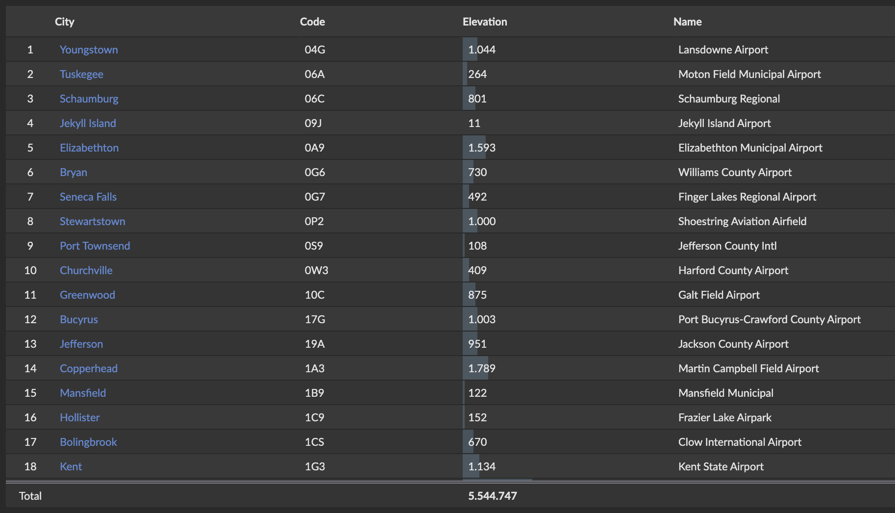
Learn more about the Table Chart →
Number Chart
A number chart displays one or more numbers, optionally with the delta to another (e.g. previous) value. Show up to 8 metrics side by side with horizontal or vertical layout, flexible number and currency formatting, and optional trend indicators.


Learn more about the Number Chart →
Sparkline Metric Chart
The Sparkline Metric chart combines a prominent "big number" metric with a sparkline visualization, showing both the current value and its trend at a glance. Supports flexible layout positioning, configurable delta display, drill-down, conditional formatting, and an optional icon from a large icon set.


Learn more about the Sparkline Metric Chart →
Pie Chart
A pie chart displays the values of a numerical column as slices of a pie, donut, or funnel. Sort values, group small slices into an 'Other' category, show hover tooltips, and configure legends to make proportional data easy to understand at a glance.
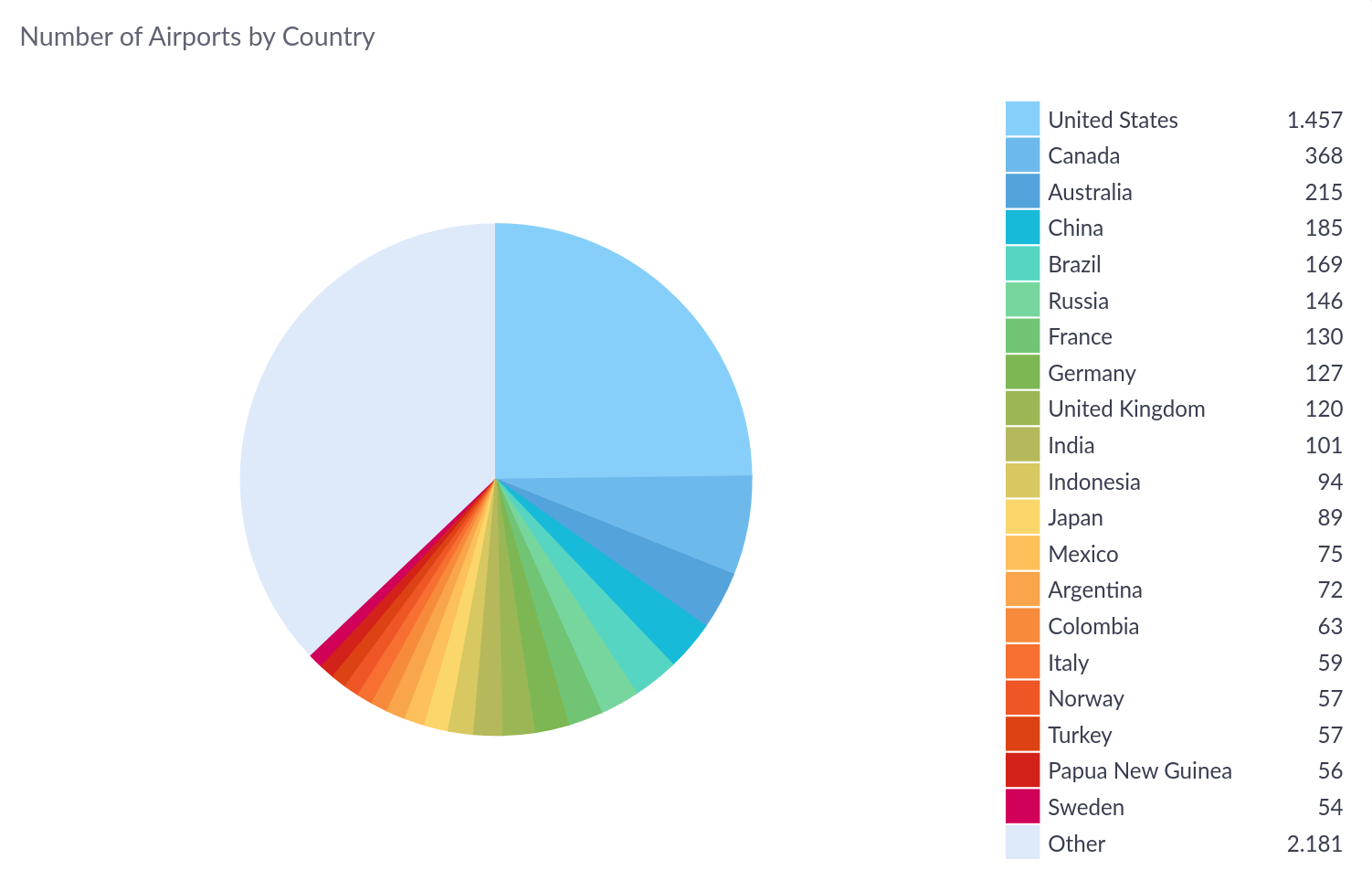

Learn more about the Pie Chart →
Line Chart
A line chart displays numeric column values as dots connected by lines on an X/Y coordinate system, typically to visualize changes to values over time. Supports multiple series, area fill, cumulative axis display, and drill-down.

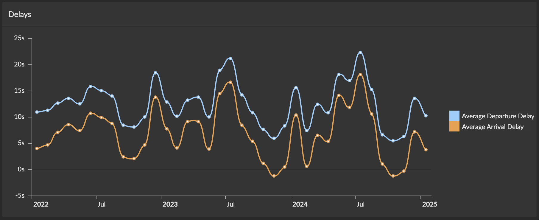
Learn more about the Line Chart →
Bar Chart
A bar chart displays numeric column values as horizontal or vertical bars in an X/Y coordinate system. Supports multiple series, stacked or grouped layouts, value labels, and drill-down for detailed data exploration.

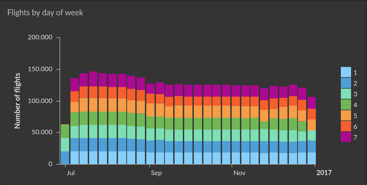
Learn more about the Bar Chart →
XY / Bubble Chart
The XY / Bubble Chart displays data points on a grid as circles with customizable sizes and colors, helping you visualize relationships between variables and identify patterns, clusters, and outliers in your data. Supports multiple Y-axis series, categorical and continuous coloring, and data-driven point sizing.
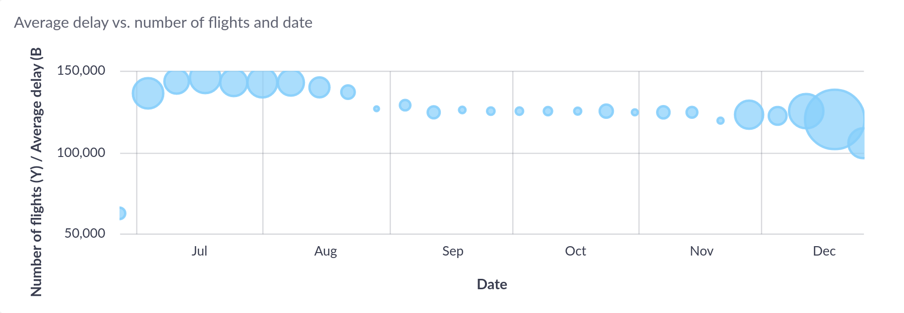
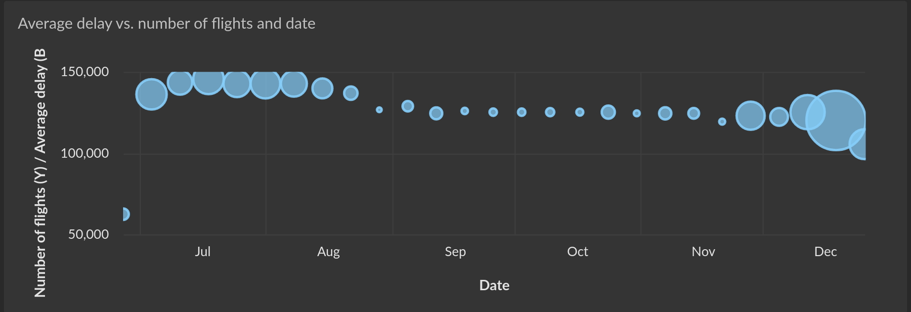
Learn more about the XY / Bubble Chart →
Map Chart
Not available on the Free plan (see Plans Comparison)
The Map Chart displays geographical data on an interactive world map. Supports three map types — points/heatmaps, lines, and GeoJSON regions — with categorical or continuous coloring, interactive legends, and hover highlighting.
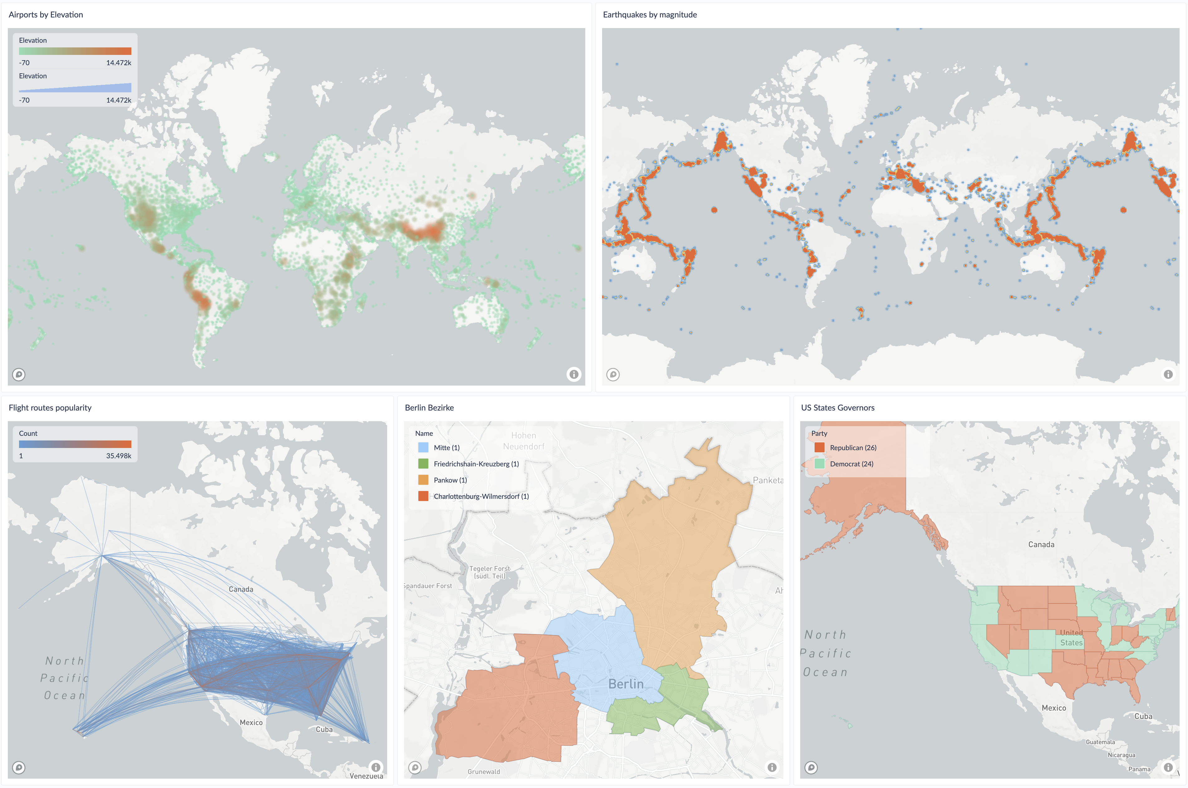
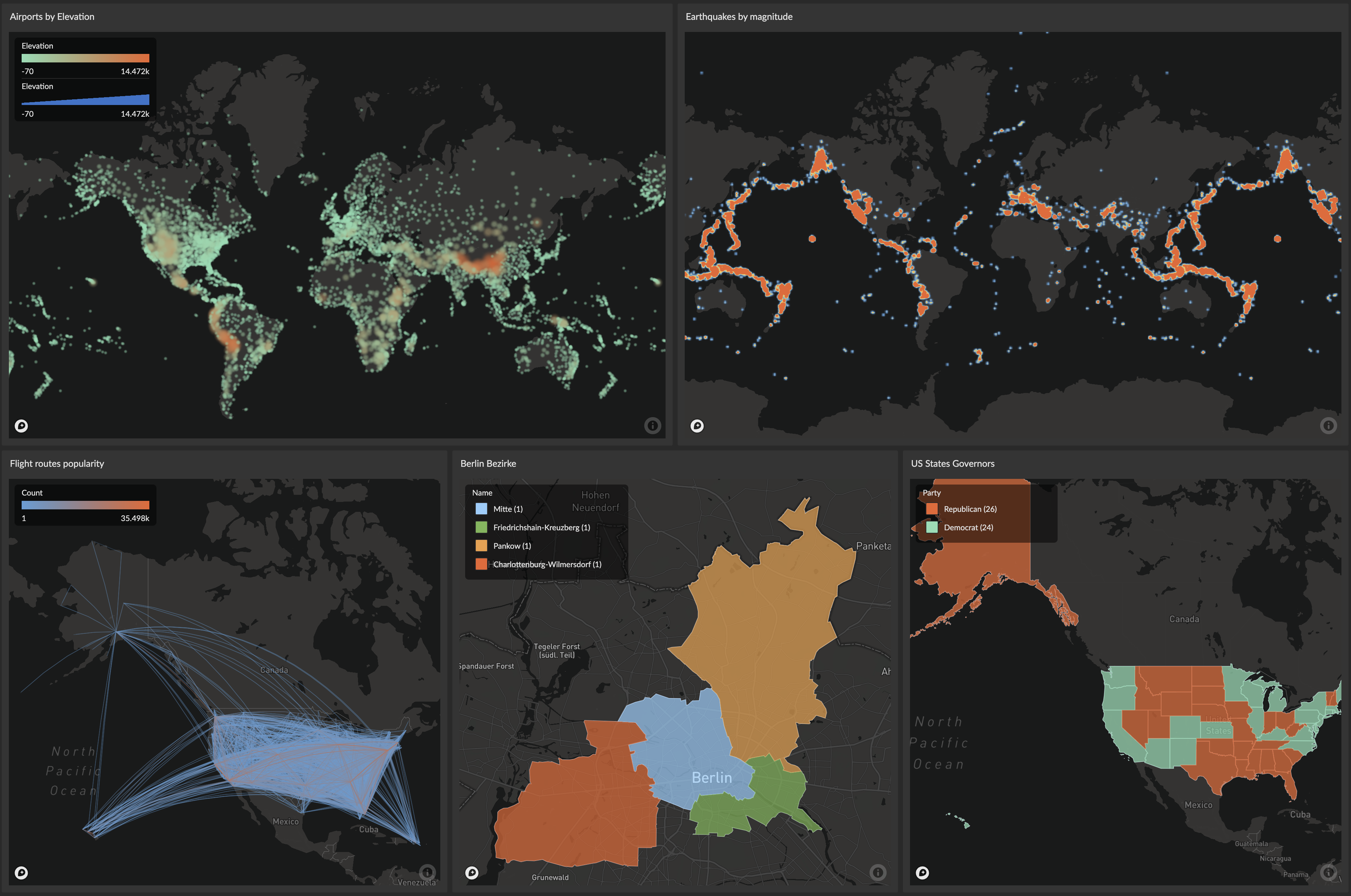
Learn more about the Map Chart →
Gauge Chart
The Gauge Chart displays a numeric value against defined range boundaries using a semicircular arc with a positional indicator, similar to a speedometer. Ranges can be configured manually or driven dynamically from query data, with customizable color zones for clear threshold visualization.


Learn more about the Gauge Chart →
Word Cloud Chart
A word cloud chart displays textual values where font size reflects the relative weight of each term. Great for keyword frequencies, customer feedback themes, and any text data where you want to highlight what's most prominent at a glance.


Learn more about the Word Cloud Chart →
Histogram Chart
A histogram chart displays the distribution of values from a single numeric column, partitioned into configurable bins visualized as horizontal or vertical bars. Perfect for understanding data spread, identifying outliers, and answering distribution questions like "how are order values distributed?"
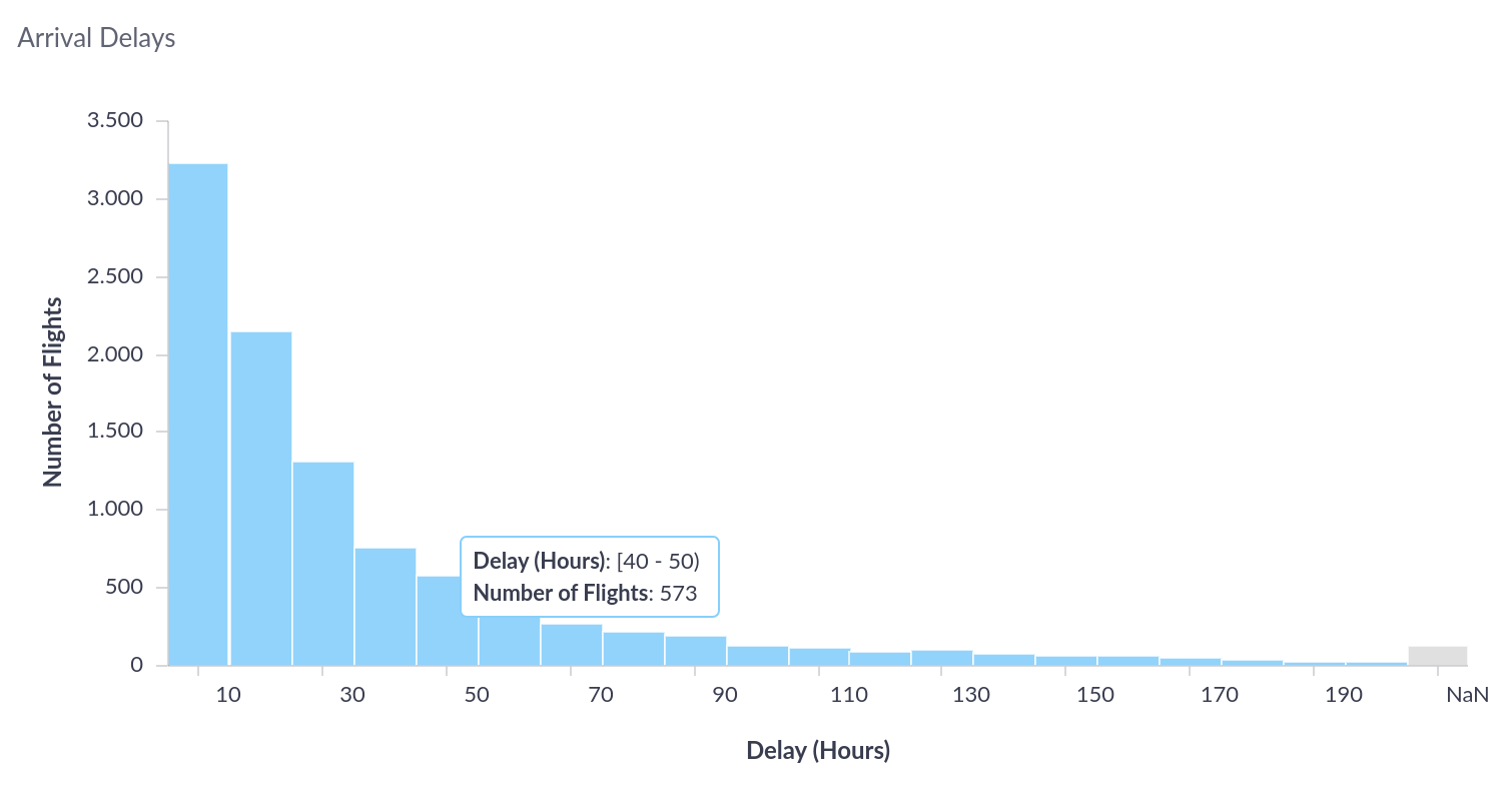
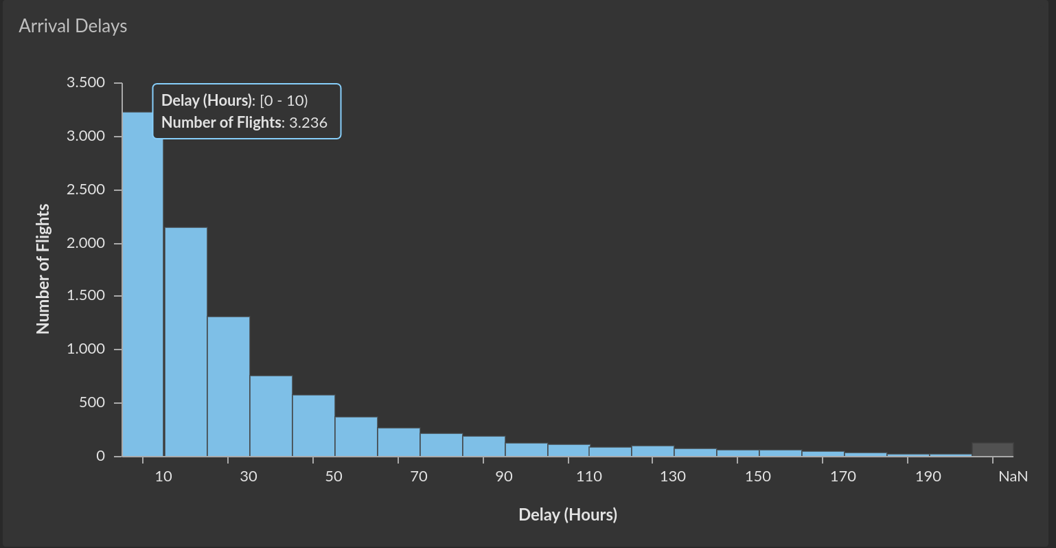
Learn more about the Histogram Chart →
Pivot / Cohort Table
The Pivot Table transforms query results into organized, hierarchical tables with multiple row and column dimensions and aggregated values. Supports multiple levels of row and column hierarchies, value aggregation, conditional formatting, color mapping, and custom sorting.


Learn more about the Pivot / Cohort Table →
Hierarchy Chart
The Hierarchy Chart visualizes hierarchical data structures in four layout options: Packed Circles, Sunburst, Treemap, and Partition. Features interactive drill-down navigation, flexible coloring strategies, and an interactive legend for filtering and highlighting — ideal for exploring nested relationships such as sales by region/category, organizational structures, or website traffic sources.

