Pie Chart
A pie chart displays the values of a numerical column as slices of a pie, donut or funnel.
| Pie | Donut | Funnel |
|---|---|---|
  |   |   |
Data Requirements
The Pie chart is available if the query result has at least 2 columns of which
at least one is numerical. By default, the first numerical column is used as the
metric for the slices of the pie, donut or funnel, with the size of the slices
corresponding to the magnitude of the value in relation to the total. A second
column is typically used for the labels of the corresponding slice, displayed in
a legend or in a tooltip over each slice. Each row in the results can thus be
interpreted as a slice of the pie, with a numerical size and a label.
For example, the result data
| Value | Label |
|---|---|
| 42 | 'A' |
| 58 | 'B' |
would yield a pie chart that looks similar to the following:


The result data for a pie chart does not need to be sorted, as the values used
for the slices are always sorted from largest to smallest. Furthermore, there is
always a limit to the number of values (slices) shown in a pie chart: Only the
largest n values are shown. All remaining values are grouped in a slice
labelled Other. See the configuration for additional
options.
Interactive Features
Tooltips
Hovering the cursor over a slice of the chart displays a tooltip with the slice's value and label.


Tooltips can display additional information - simply add more columns to the SQL result and these will be displayed in the tooltip for the corresponding slice together with the slice label and value.
Breakdown
Clicking on a slice of a pie chart separates the selected slice from the pie to give it visual focus.


Filtering
Clicking on an item in the legend of the chart toggles the inclusion of the corresponding slice in the chart. When a slice is excluded its value is removed from the aggregated total and the sizes of the remaining slices are adjusted accordingly.


Configuration
The Pie chart configuration supports the following main options:


-
S / M / L / XL: Text size for legend, labels and tooltips.
-
Pie / Donut / Funnel: The chart style.
-
Total: Turn on/off the Total in center (only available for Donut style).
-
Labels: Turn on/off labels for each slice that render connected to the slice with a line in the chart.


-
Legend: Turn on/off the Legend. If on, you can also select the placement of the legend (right / left / top / bottom),
-
Tooltip: Turn on/off Tooltips, which display over the chart when hovering over a slice.
-
Draw outline: Turn on/off outline, which separates the individual slices.
Settings
The configuration of the columns of the pie chart defines which column is used
for the numerical values and which column is used for the labels. The
pre-selection done by Cluvio is based on the type of result columns. All
additional columns (configured with -) are included in the tooltips, if enabled,
and can be used for drill-down actions.


Use the Value Formatting to render the numbers rounded to a specific number of decimals, abbreviated (i.e. 1k instead of 1000) or formatted as a currency.
Legend
If enabled, the legend can be configured to show only the value, the value and percentage, or only the percentage for each slice of the pie.


If Automatic Legend is disabled, the option Max label length becomes
available and can be used to specify an explicit maximum length for the labels.
Additional Options
Because a pie chart with too many slices becomes visually cluttered, there is
always a maximum number of values included in the chart. By default, with Sort Values
enabled, these are always the n largest values (default 20). If there are more values in the result, all
but the largest n values will be summed up in a single slice called Other.


If Sort Values is disabled, the top n values included in the chart are determined
by the order of the result rows.
By default, zero values are never included in the chart. If they should be included
(if they are in the largest / top n values), the Include Zero Values option can be enabled.
Note that negative values are always ignored.
With the Donut visualization, the Donut Width option is available as an
additional option and can be used to control the width of the donut ring (i.e.
how large the "hole" is).
Colors
The Colors section of the chart configuration can be used to customize the
colors for some or all of the values. When the color is set to Automatic
(indicated by a grayed-out A), a color is selected from the dashboard color
scheme automatically. If a color is specified, that color is used for that
specific value, when present in the results.


Any newly appearing value in the SQL results (i.e. a value for which a color is not manually set), will be assigned a color automatically.
Drill-Down
A drill-down can be configured for the pie chart, so that when clicking on a slice a filter value is applied on the same or a different dashboard.


Use Navigate to to select the target dashboard of the drill-down action.
If the target dashboard is not the same dashboard that the pie chart is on,
the UI navigates to the chosen dashboard.
In the Apply filters section, select one or more filters from the target
dashboard and for each a result column whose value should be applied to it
when the user performs the drill-down.
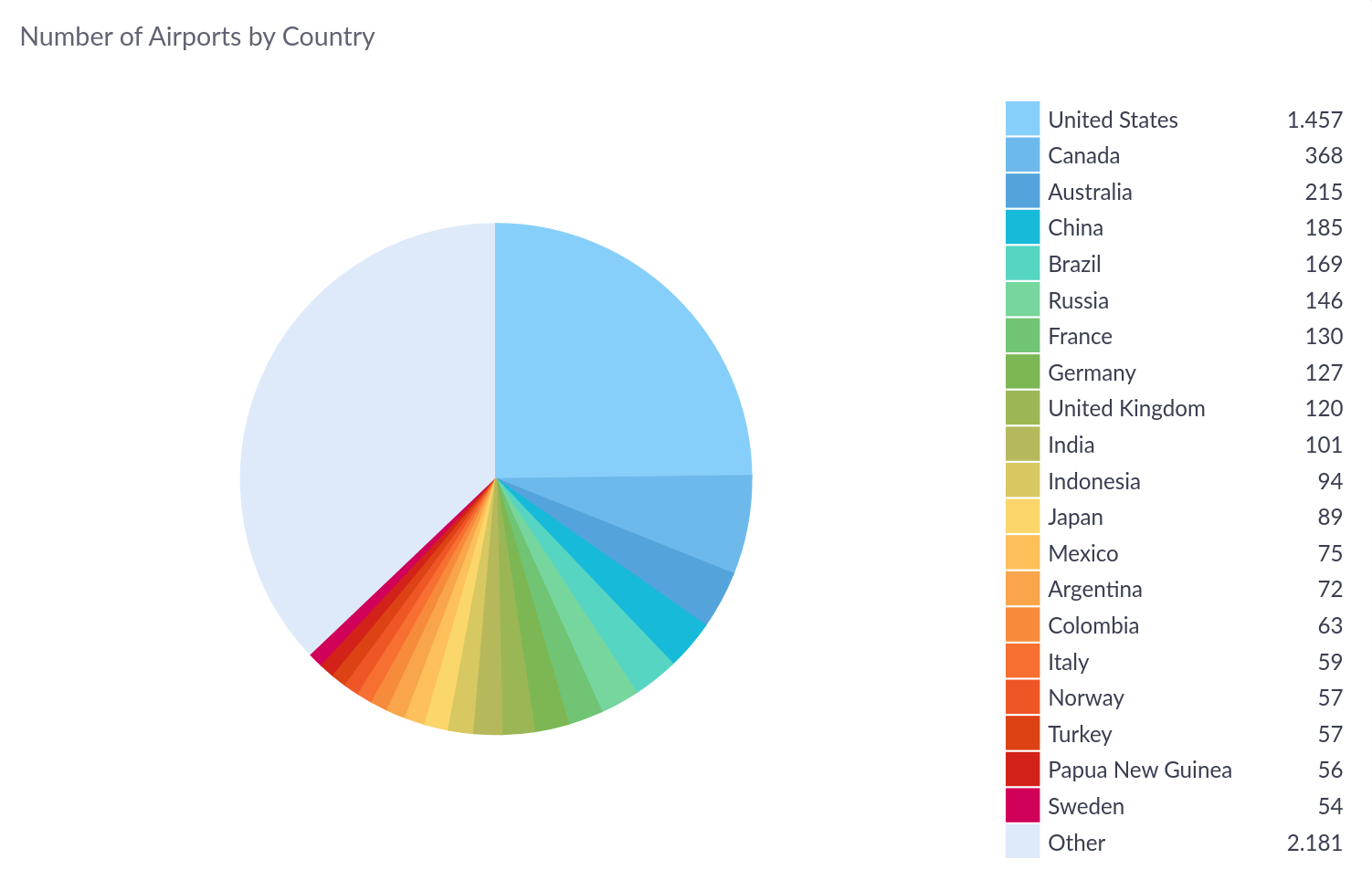
Examples
A typical SQL query for use with a pie chart uses a GROUP BY expression on the
column to use for the labels and an aggregate function to produce the numerical
values. For example, the following query calculates the number of airports by
country on Cluvio's sample data:
SELECT country, COUNT(1)
FROM airports
GROUP BY 1

