XY / Bubble Chart
The XY / Bubble Chart displays data points on a grid as circles with customizable sizes and colors. This chart type helps you visualize relationships between variables and identify patterns, clusters, and outliers in your data.
The XY / Bubble Chart supports scatter and bubble visualizations, multiple Y-axis series, categorical and continuous coloring, data-driven sizing, interactive legends, and point labels.
Key Features
- Flexible Data Mapping: Map data to X and Y coordinates with optional size and color dimensions
- Multiple Series: Display multiple Y-axis series with distinct colors and legends
- Categorical Colors: Color points by categories with interactive legend controls
- Continuous Colors: Apply color gradients based on numeric values
- Variable Sizing: Scale point sizes based on data values
- Point Labels: Display labels directly on data points
- Interactive Tooltips: Rich context on hover with all data values
- Axis Customization: Configure titles, scales, currency, and percentages
- Legend Controls: Toggle series visibility and interactive filtering
Data Requirements
An XY / Bubble Chart requires at least 2 columns: one for X coordinates (numerical or date/time) and one or more for Y coordinates (numerical). Additional columns can be used for size, color, labels, and tooltips.
Minimum Requirements:
- X Axis: 1 numerical or date/time column for horizontal position
- Y Axis: 1 or more numerical columns for vertical position (supports multiple series)
Optional Enhancements:
- Size: Numerical column for variable bubble sizes
- Color: Numerical (continuous gradient) or text/categorical (discrete colors) column
- Labels: Any column for displaying text on data points
- Tooltips: Any additional columns for hover information
Basic Example
A simple query with three columns:
SELECT
  x,     -- X axis
  y,     -- Y axis
  size,  -- Size (bubble size)
FROM my_data
| x | y | size |
|---|---|---|
| 1 | 1 | 1 |
| 2 | 2 | 2 |
| 3 | 3 | 3 |
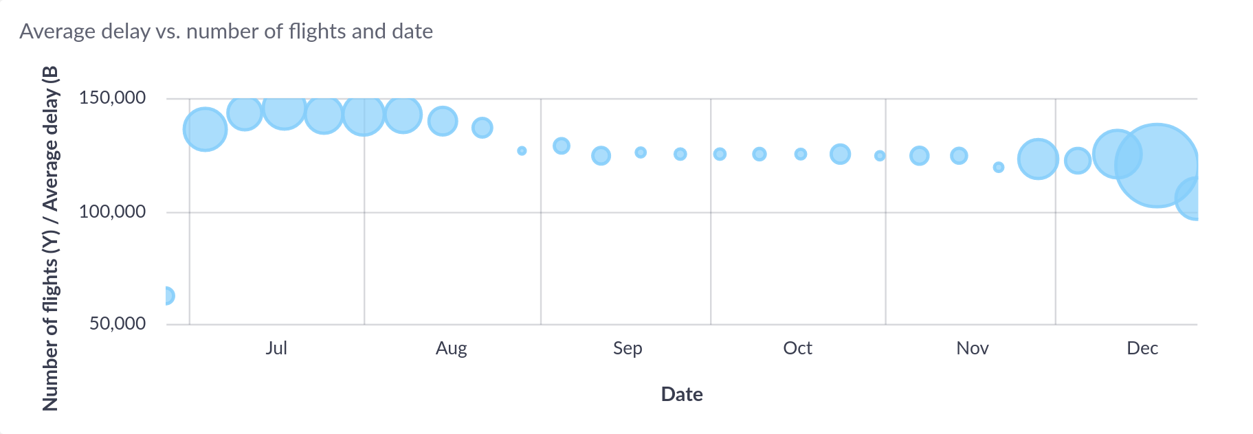
produces the following scatter plot:


Advanced Example with Size and Color
A query with size and categorical color columns:
SELECT
  revenue,           -- X axis
  profit_margin,     -- Y axis
  company_size,      -- Size (bubble size)
  industry,          -- Color (categorical)
  company_name       -- Labels and tooltips
FROM companies
WHERE fiscal_year = 2024
This creates a bubble chart where:
- Position shows revenue vs. profit margin relationship
- Bubble size represents company size
- Color distinguishes industries
- Labels show company names
- Tooltips include all column values


Interactive Features
Tooltips
Hover over any data point to see a tooltip with coordinates, size, color values, and all additional column data.


Legend Interactions (Multiple Y Series)
When using multiple Y-axis series, the legend provides series management:
- Click to toggle: Show/hide specific Y-axis series
- Visual feedback: Hidden series are grayed out in the legend
- Axis persistence: Chart maintains consistent axis ranges when toggling series
Legend Interactions (Categorical Colors)
When using categorical colors, the legend provides powerful filtering capabilities:


- Click to toggle: Hide/show specific categorical values
- Alt+click to focus: Show only the selected category and hide all others
- Hover highlighting: Hovering over legend items highlights corresponding points and dims others
- Item counts: Shows the number of data points for each category
- Clear button: Appears when categories are hidden to restore all at once
Configuration
Basic Settings


- S, M, L, XL: Preset font sizes for axis and legend labels
- Tilt X Axis: Rotate X axis labels by 45 degrees for longer text
Series Configuration
The column configuration determines which result columns are used for the chart axes and visual properties.


Column Assignments:
- X Axis: Select one numerical or date/time column for horizontal position (required)
- Y Axis: Select one or more numerical columns for vertical position (required)
- Single Y column: Enables color and size columns
- Multiple Y columns: Each creates a separate series with its own color
- Color: Available when using a single Y column
- Numerical column: Continuous color gradient
- Text/categorical column: Discrete colors with interactive legend
- Size: Numerical column for variable bubble sizes (optional)
- Labels: Any column for displaying text on points (optional)
- Hidden (-): Additional columns included only in tooltips
Configuration Rules:
- Multiple Y series cannot be combined with a Color column
- Color and Size columns are only available with a single Y series
X Axis Options
Configure the horizontal axis appearance and formatting.


- Title: Custom label displayed below the axis
Numerical X Axis:
- Logarithmic Scale: Apply logarithmic transformation (requires positive values)
- Format as Currency: Display values with currency symbol
- Currency Symbol: Custom currency symbol (defaults to dashboard setting)
- Format as Percentage: Display values with percentage symbol
- Precision: Number of decimal places for rounded values
- Round Values: Enable decimal rounding
Date/Time X Axis:
- Date and time values are automatically formatted based on the data range and zoom level
Y Axis Options
Configure the vertical axis appearance, formatting, and line connections.


- Title: Custom label displayed beside the axis
- Line Width: Connect points with lines (0 = no lines, >0 = line chart overlay)
- Logarithmic Scale: Apply logarithmic transformation (requires positive values)
- Format as Currency: Display values with currency symbol
- Currency Symbol: Custom currency symbol (defaults to dashboard setting)
- Format as Percentage: Display values with percentage symbol
- Precision: Number of decimal places for rounded values
- Round Values: Enable decimal rounding
Line Width Usage:
- Set to 0 for pure scatter/bubble visualization
- Set to 1-5 to connect points, creating a line chart overlay
- Useful for showing trends or temporal sequences
Data-driven Colors (Continuous)
Use continuous colors when your color column contains numeric data. Colors are smoothly interpolated across a range, creating a gradient effect that represents the magnitude of values.


Configuration Options:
- Color Range: Choose from predefined color schemes (sequential, diverging, or custom gradients)
- Invert Range: Reverse the color gradient direction
- Min/Mid/Max Values: Define custom minimum, midpoint, and maximum bounds for color mapping
- Values below minimum: Use minimum color
- Values above maximum: Use maximum color
- Automatic: Use actual data range
Use Cases:
- Temperature or time-based data (cool to warm colors)
- Density or concentration (light to dark intensity)
- Performance metrics (diverging scale from below to above target)
- Risk or confidence scores (green to yellow to red gradient)
Example: If your color column has values from 0-100 but you want to emphasize the 40-60 range, set:
- Color min value: 40
- Color max value: 60
- Values below 40 use the leftmost color
- Values above 60 use the rightmost color
Data-driven Colors (Categorical)
Use categorical colors when your color column contains text, strings, or discrete values (like product categories, regions, or status labels). Each unique value is assigned a distinct color, creating an interactive legend for filtering and exploration.


Configuration Options:
- Color Scheme: Colors are assigned from the dashboard color scheme
- Custom Colors: Assign specific colors to individual category values via color mapping
- Legend Display: Interactive legend showing all categories with item counts
- Click to toggle category visibility
- Alt+click to focus on a single category
- Hover highlighting between chart and legend
Legend Interactions:
When categorical coloring is enabled, the legend provides powerful filtering:
- Hover to highlight: Points in the hovered category stay at full opacity while others are dimmed (20% opacity)
- Click to toggle: Hide/show individual categories from the chart
- Alt+click to focus: Show only the selected category, hiding all others
- Clear button: Restore all hidden categories at once
Use Cases:
- Customer segments or demographics
- Product lines or categories
- Geographic regions or territories
- Status labels or classifications
- Department or team groupings
Data-driven Sizes
The chart can vary the size of bubbles based on a numeric column from your data.


Default Behavior:
- Bubble sizes range from 1 to 50 pixels
- Smallest data value gets size 4
- Largest data value gets size 50
- All other values scaled proportionally
Configuration Options:
Size Range Customization:
- Minimum Size: Smallest bubble size (default: 4)
- Maximum Size: Largest bubble size (default: 50)
- Adjust range to balance visibility and overlap
Value Range Customization:
- Size Min Value: Custom lower bound for size mapping
- Size Max Value: Custom upper bound for size mapping
- Values outside bounds are clamped to min/max sizes
Use Cases:
- Population or volume metrics
- Budget or revenue amounts
- Quantity or frequency data
- Weighted importance scores
Example: If your size column ranges from 0-1000 but most values are below 100:
- Set Size Max Value to 100
- Values above 100 will still use maximum size
- Better visual distribution for the 0-100 range
Point Labels
Display labels directly on data points for immediate identification.


Configuration:
- Show Labels: Toggle label visibility
- Label Column: Select any column from your data to display as labels
- Label Position: Choose label placement relative to points
- Right: Label appears to the right of the point (default)
- Left: Label appears to the left of the point
- Top: Label appears above the point
- Bottom: Label appears below the point
- Middle: Label appears centered on the point
Best Practices:
- Use for charts with moderate number of points to avoid label overlap
- Choose short, meaningful labels (e.g., abbreviations, codes)
- Position labels to minimize collision with other points
- Consider hiding labels on dashboard view if chart is small
- Labels are always included in tooltips regardless of this setting
Legend


- Show title: Display/hide legend title (categorical mode only)
- Show number of values: Display/hide value counts in legend (categorical mode only)
- Tooltip: Enable/disable hover tooltips
Axis Scales and Ranges
Logarithmic Scales
Enable logarithmic scaling for X or Y axes when:
- Data spans multiple orders of magnitude
- Relationships are multiplicative rather than additive
- You want to emphasize percentage changes rather than absolute changes
Requirements:
- All values must be positive (>0)
- Chart will show an error if negative or zero values are present
Fixed Axis Ranges
When legend is enabled and you toggle series visibility:
- Axis ranges remain fixed at their initial calculated bounds
- Prevents jarring rescaling when showing/hiding series
- Maintains consistent visual reference frame
- Useful for comparing multiple series at consistent scales
Best Practices
Data Preparation
- Filter Outliers: Consider removing extreme outliers that skew axis ranges
- Handle NULL Values: NULL values are excluded from the visualization
- Appropriate Precision: Match decimal precision to data significance
- Meaningful Grouping: For categorical colors, group rare categories to reduce legend size
Chart Configuration
- Choose Appropriate Type:
- Scatter plot (no size): For exploring X-Y relationships
- Bubble chart (with size): For visualizing three dimensions
- Line overlay (line width > 0): For showing trends or sequences
- Color Strategy:
- Use categorical for grouping and filtering
- Use continuous for showing gradients and intensities
- Size Range: Balance between visibility (larger) and overlap prevention (smaller)
- Legend Position: Position to avoid covering important data regions
- Labels: Use sparingly on crowded charts to maintain readability
Visual Design
- Color Contrast: Ensure points are visible against chart background
- Size Scaling: Avoid extreme size differences that obscure small points
- Axis Titles: Provide clear, descriptive titles with units
- Tooltip Content: Include all relevant context without overwhelming
- Label position: Choose label positions that minimize overlap
Performance
- Large Datasets: Consider aggregating or sampling for >10,000 points
- Multiple Series: Limit to 5-7 series for legend readability
- Categorical Values: Limit to 20-30 categories for legend usability
- Line Width: Use line connections only when showing sequences or trends
User Experience
- Context: Add chart titles and descriptions explaining the visualization
- Units: Include units in axis titles or tooltips
- Interactivity: Enable tooltips and legends for exploration
- Responsive Design: Test appearance at different dashboard sizes
- Color Accessibility: Choose color schemes with sufficient contrast
Examples
Sales Performance Analysis
SELECT
  marketing_spend,              -- X axis
  revenue,                      -- Y axis
  customer_count,               -- Size
  region,                       -- Color (categorical)
  campaign_name                 -- Labels and tooltips
FROM campaigns
WHERE year = 2024
Configuration:
- Chart Type: Bubble chart with categorical colors
- X Axis: Marketing Spend (currency formatting)
- Y Axis: Revenue (currency formatting)
- Size: Customer Count
- Color: Region (categorical with legend)
- Labels: Campaign Name
- Legend: Enabled with right position, show counts
Usage:
- Hover over legend regions to highlight campaigns by geography
- Alt+click to focus on specific regions
- Click to hide underperforming regions
- Bubble size shows customer volume
- Position shows ROI relationship
Product Comparison
SELECT
  price,                        -- X axis
  rating,                       -- Y axis
  review_count,                 -- Size
  satisfaction_score,           -- Color (continuous)
  product_name                  -- Labels and tooltips
FROM products
WHERE category = 'Electronics'
Configuration:
- Chart Type: Bubble chart with continuous colors
- X Axis: Price (currency, logarithmic scale)
- Y Axis: Rating (0-5 scale)
- Size: Review Count
- Color: Satisfaction Score (green to red gradient)
- Labels: Product Name (right position)
Usage:
- Logarithmic X scale for wide price range
- Color shows satisfaction beyond simple rating
- Size indicates review volume/popularity
- Identify sweet spot: high rating, good price, many reviews
Multi-Series Comparison
SELECT
  month,                        -- X axis
  actual_sales,                 -- Y axis series 1
  target_sales,                 -- Y axis series 2
  forecast_sales                -- Y axis series 3
FROM sales_metrics
WHERE year = 2024
ORDER BY month
Configuration:
- Chart Type: Multi-series scatter with line connections
- X Axis: Month (temporal)
- Y Axis: Actual, Target, and Forecast (multiple series)
- Line Width: 2 (connect points to show trends)
- Legend: Enabled to toggle series
- Y Axis: Currency formatting
Usage:
- Compare three metrics on same timeline
- Toggle series visibility to focus on specific comparisons
- Line connections show temporal progression
- Fixed axis ranges maintain consistent scale