Map Chart
Not available on the Free plan (see Plans Comparison)
The Map Chart displays geographical coordinates (latitude/longitude) and associated information on an interactive world map. This chart type helps you visualize geographic data with customizable colors, sizes, and comprehensive legend controls.
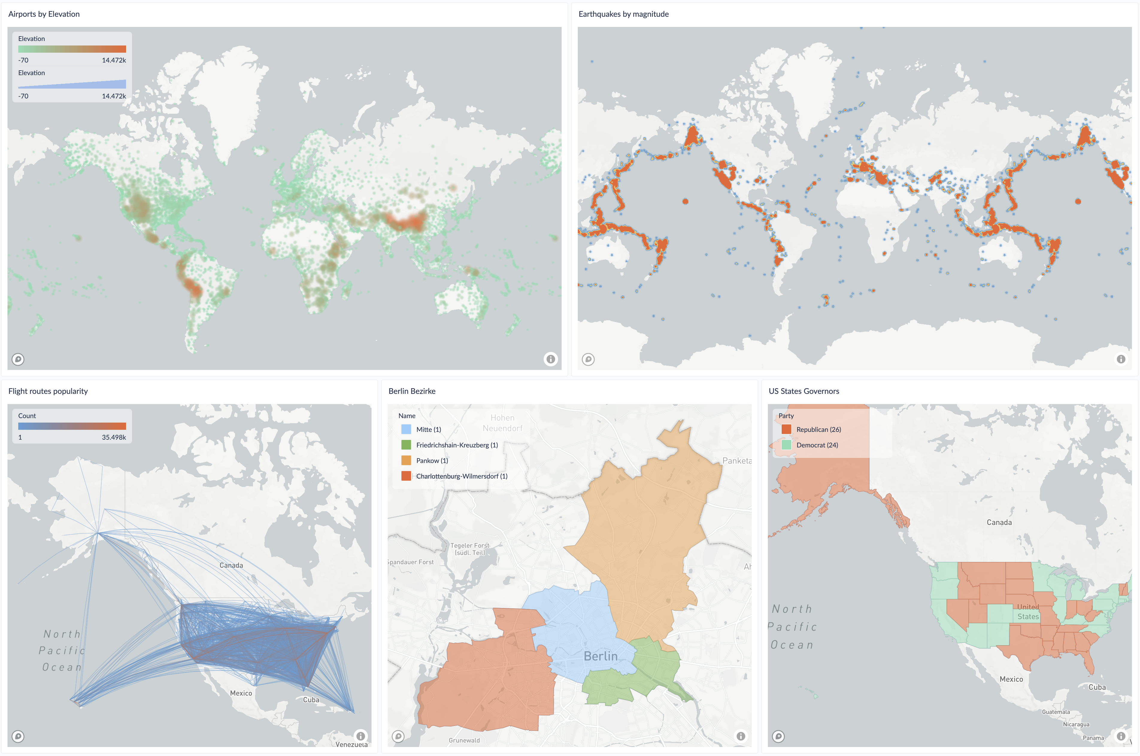
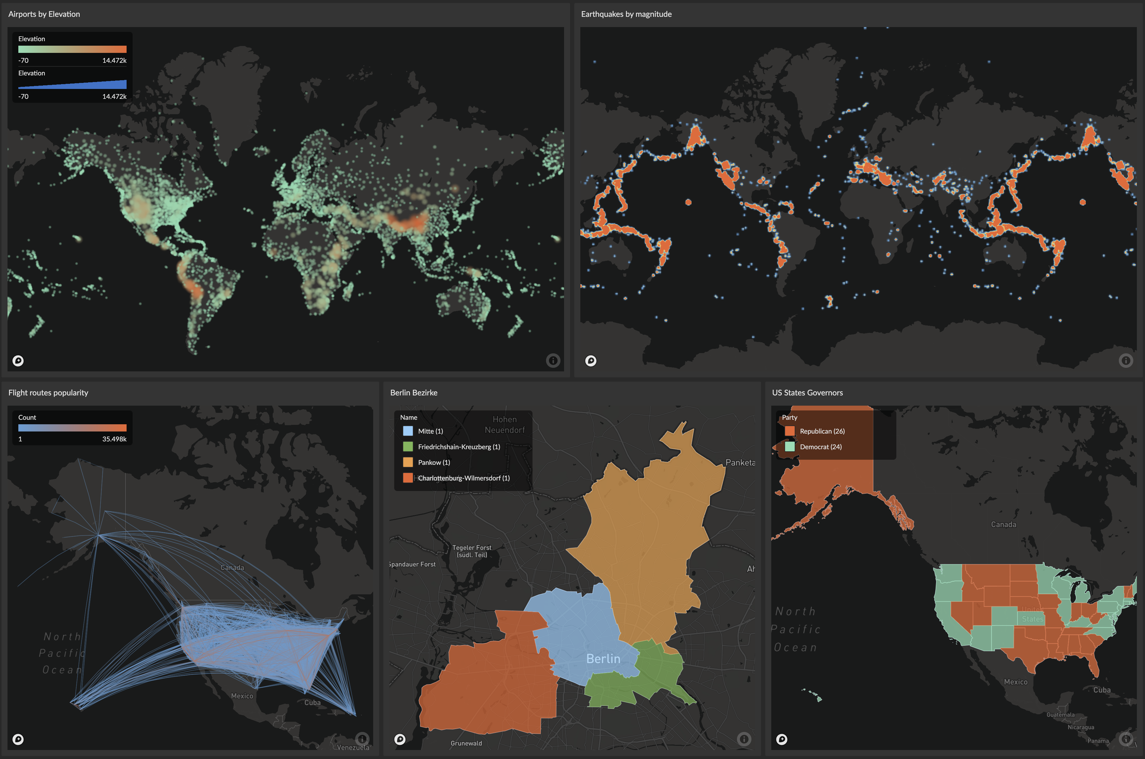
The Map Chart supports three distinct map types (Points/Heatmaps, Lines, and GeoJSON), categorical and continuous coloring, interactive legends, hover highlighting, and flexible data handling for unmapped values.
Key Features
- Multiple Map Types:
- Points/Heatmaps: Visualize individual locations with lat/lon coordinates
- Lines: Display connections between two locations (origin and destination)
- GeoJSON: Render complex shapes and boundaries (Polygon, MultiPolygon, LineString, etc.)
- Flexible Coloring: Both categorical and continuous color modes
- Interactive Legends: Toggle visibility, focus on specific categories
- Hover Highlighting: Real-time visual feedback with legend integration
- Unmapped Value Handling: Configure behavior for values without explicit colors
- Size Mapping: Variable sizing based on data values
- Comprehensive Tooltips: Show detailed information on hover
- Zoom & Pan Controls: Interactive map navigation with optional UI controls
Map Types and Data Requirements
The map chart supports three distinct visualization types, each with specific data requirements:
1. Points/Heatmaps
The Points map type visualizes individual geographical locations as circles with customizable sizes and colors.
Data Requirements:
- Minimum: 2 columns with floating point numbers (
FLOAT,DOUBLE,DECIMALor equivalent)- Latitude: Value between -90 and 90
- Longitude: Value between -180 and 180
- Optional: Additional columns for size, color (categorical or continuous), and tooltip information
Example Query:
SELECT
  latitude,           -- Required: Latitude coordinate
  longitude,          -- Required: Longitude coordinate
  country,            -- Optional: Category for coloring
  population,         -- Optional: Value for sizing
  city_name,          -- Optional: Additional data for tooltips
  gdp_per_capita      -- Optional: Additional metrics
FROM city_data
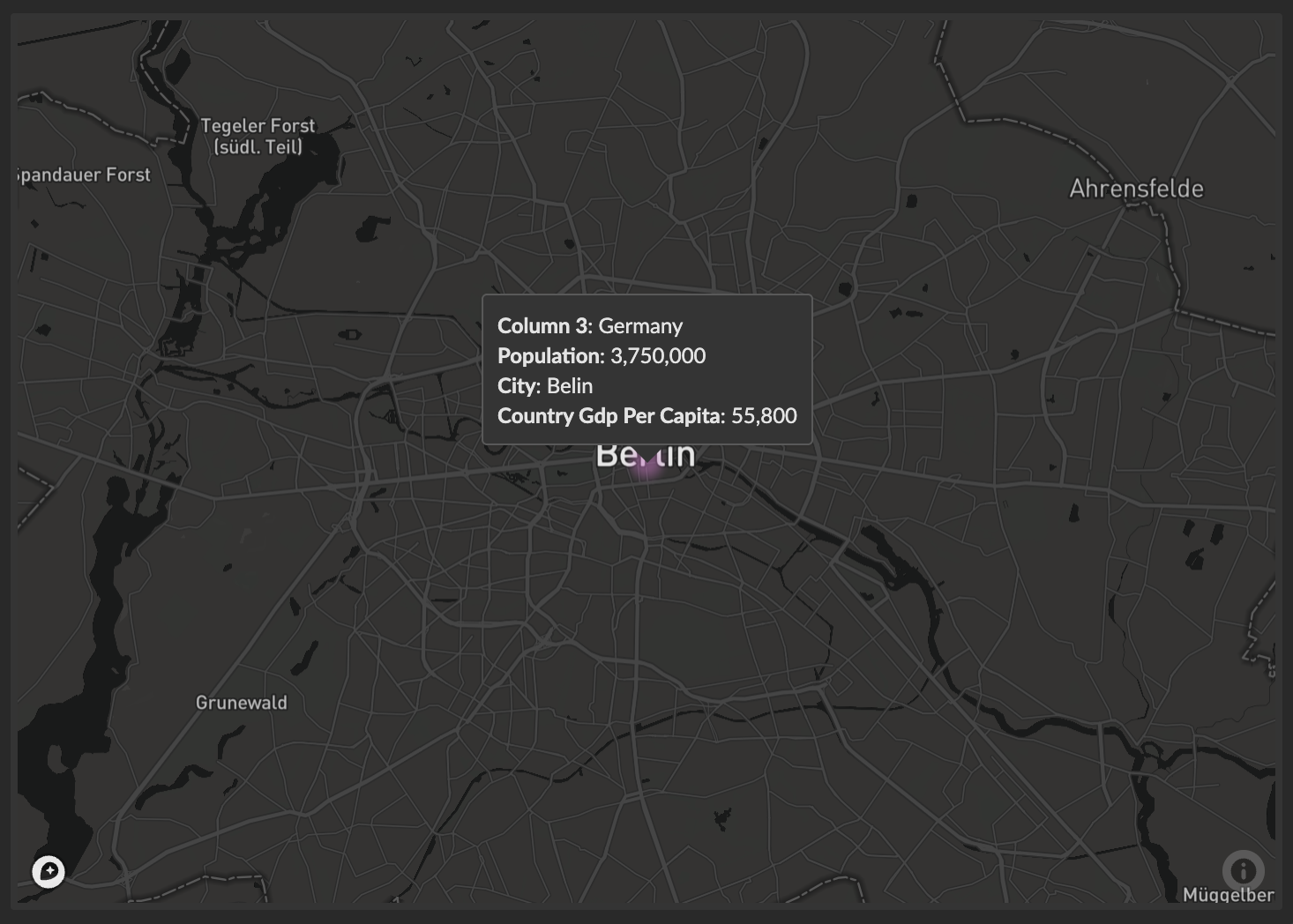
Basic Example:
A query result with two columns:
| latitude | longitude |
|---|---|
| 52.52 | 13.4050 |
produces the following map chart with a highlighted location in the center of Berlin, Germany:

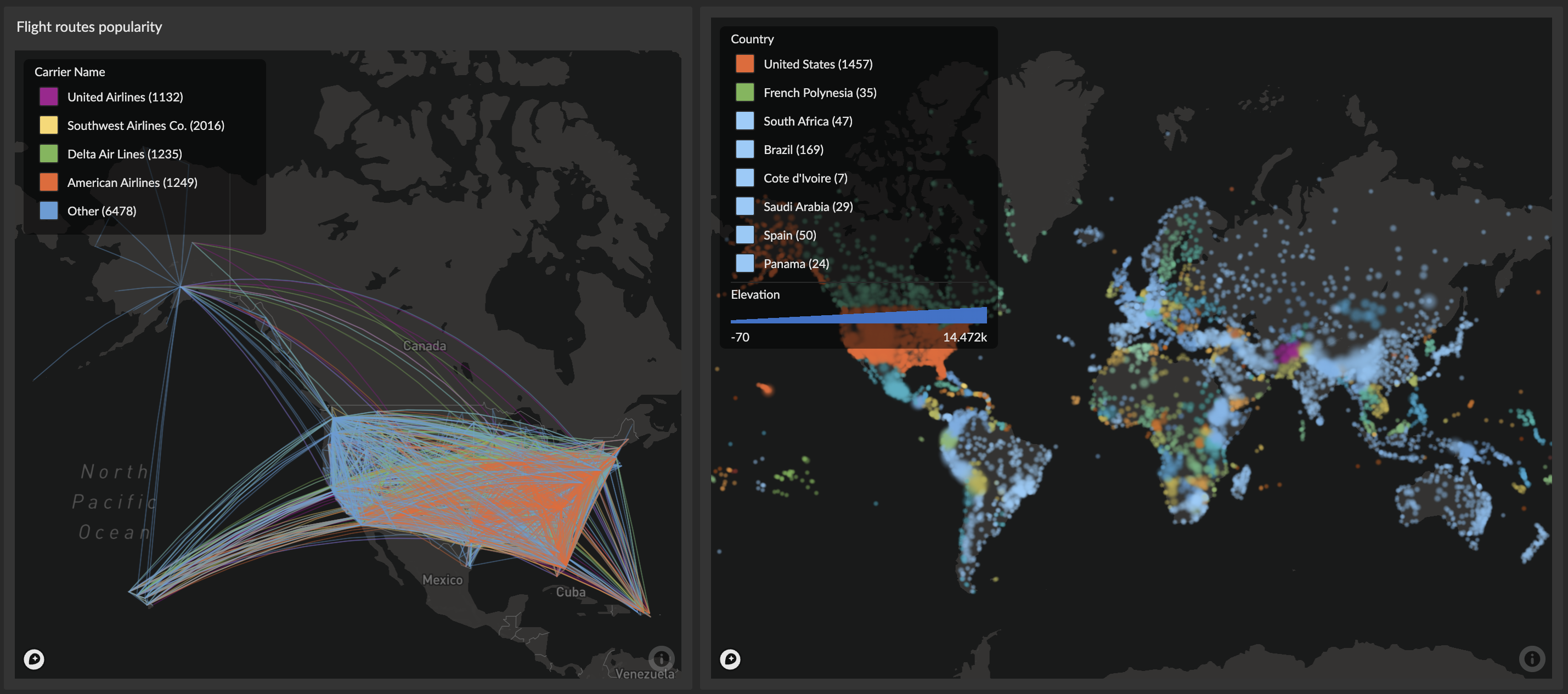
2. Lines
The Lines map type connects two geographical locations with straight lines or curved arcs, useful for visualizing routes, connections, or flows.
Data Requirements:
- Minimum: 4 columns with floating point numbers representing two coordinate pairs
- Origin Latitude: Start point latitude (-90 to 90)
- Origin Longitude: Start point longitude (-180 to 180)
- Destination Latitude: End point latitude (-90 to 90)
- Destination Longitude: End point longitude (-180 to 180)
- Optional: Additional columns for line thickness, color, and tooltip information
Example Query:
SELECT
  origin_lat,         -- Required: Start point latitude
  origin_lon,         -- Required: Start point longitude
  dest_lat,           -- Required: End point latitude
  dest_lon,           -- Required: End point longitude
  flight_count,       -- Optional: Value for line thickness/color
  route_name,         -- Optional: Route identifier
  distance_km         -- Optional: Additional information
FROM flight_routes
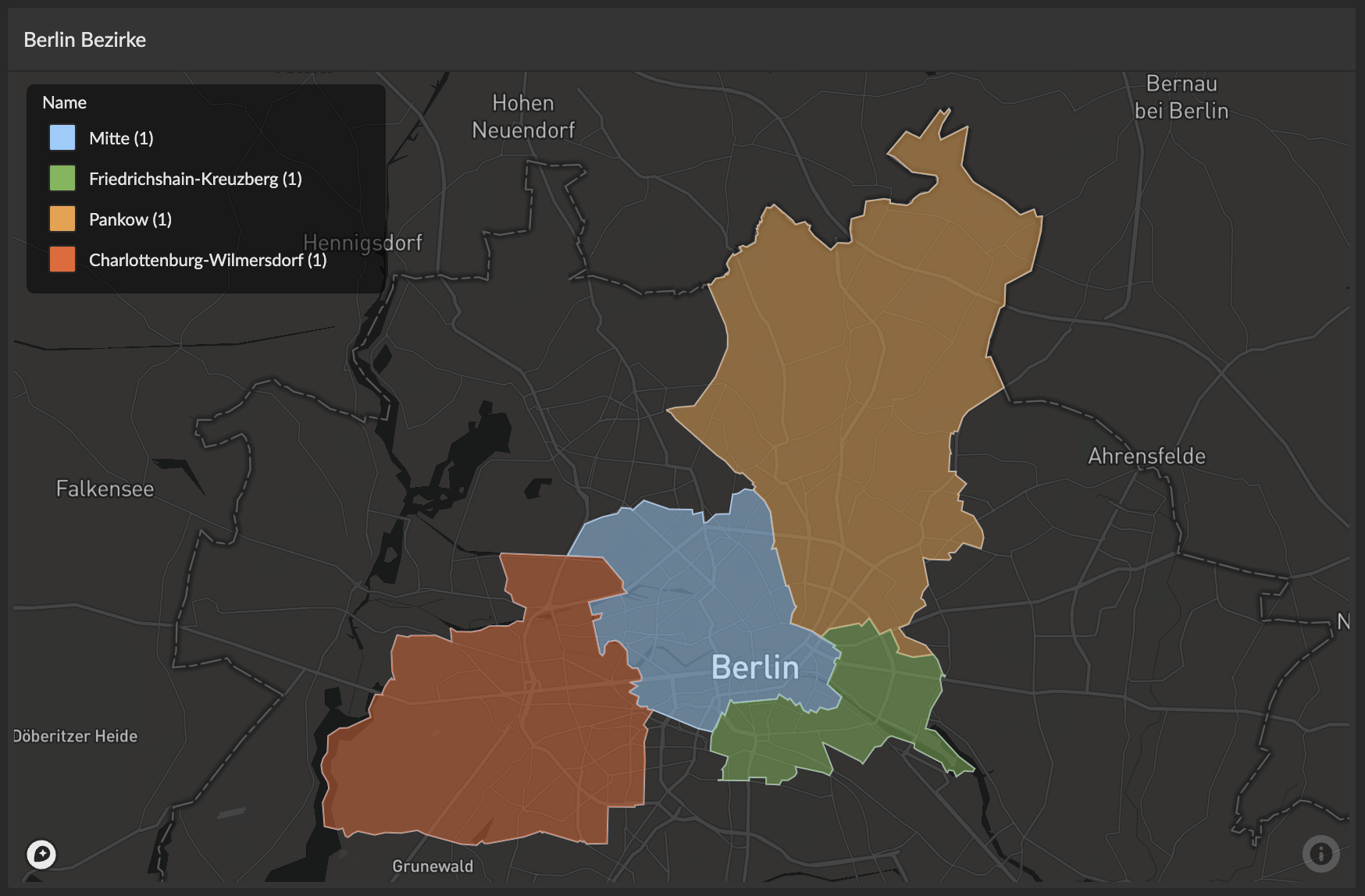
3. GeoJSON
The GeoJSON map type renders complex geographical shapes and boundaries using GeoJSON data, ideal for displaying regions, polygons, and complex geometries.
Data Requirements:
- Minimum: 1 column containing valid GeoJSON data
- Can be a complete Feature object (with properties)
- Can be a raw Geometry object
- Optional: Additional columns for color (categorical or continuous) and tooltip information
Supported GeoJSON Geometry Types:
Point- Single geographical pointMultiPoint- Collection of pointsLineString- Series of connected line segmentsMultiLineString- Collection of line stringsPolygon- Closed shape with optional holesMultiPolygon- Collection of polygons
Example Query:
SELECT
  geography::STAsText() as geojson,  -- Required: GeoJSON geometry
  region_name,                       -- Optional: Category for coloring
  population,                        -- Optional: Value for color intensity
  area_km2                           -- Optional: Additional information
FROM regions
GeoJSON Feature Example:
{
  "type": "Feature",
  "geometry": {
    "type": "Polygon",
    "coordinates": [[[-77.0, 38.9], [-77.0, 38.8], [-76.9, 38.8], [-76.9, 38.9], [-77.0, 38.9]]]
  },
  "properties": {
    "name": "District of Columbia"
  }
}
GeoJSON Geometry Example:
{
  "type": "Polygon",
  "coordinates": [[[-77.0, 38.9], [-77.0, 38.8], [-76.9, 38.8], [-76.9, 38.9], [-77.0, 38.9]]]
}
Interactive Features
Map Navigation
By default, map charts are interactive:
- Move the map: Press and hold the left mouse button anywhere on the map, then move the mouse. Release the left mouse button to complete the movement. Alternatively, use the arrow keys on your keyboard.
- Tilt the map: Press and hold the right mouse button anywhere on the map, then move the mouse.
- Zoom in and out: Use the scroll wheel of the mouse. Alternatively, use the
+and-keys on the numeric keypad of your keyboard.
A map chart can also be configured to show a UI control in the top-right corner of the map for zooming and tilting. To enable it, enable the Show zoom controls option in the report editor.
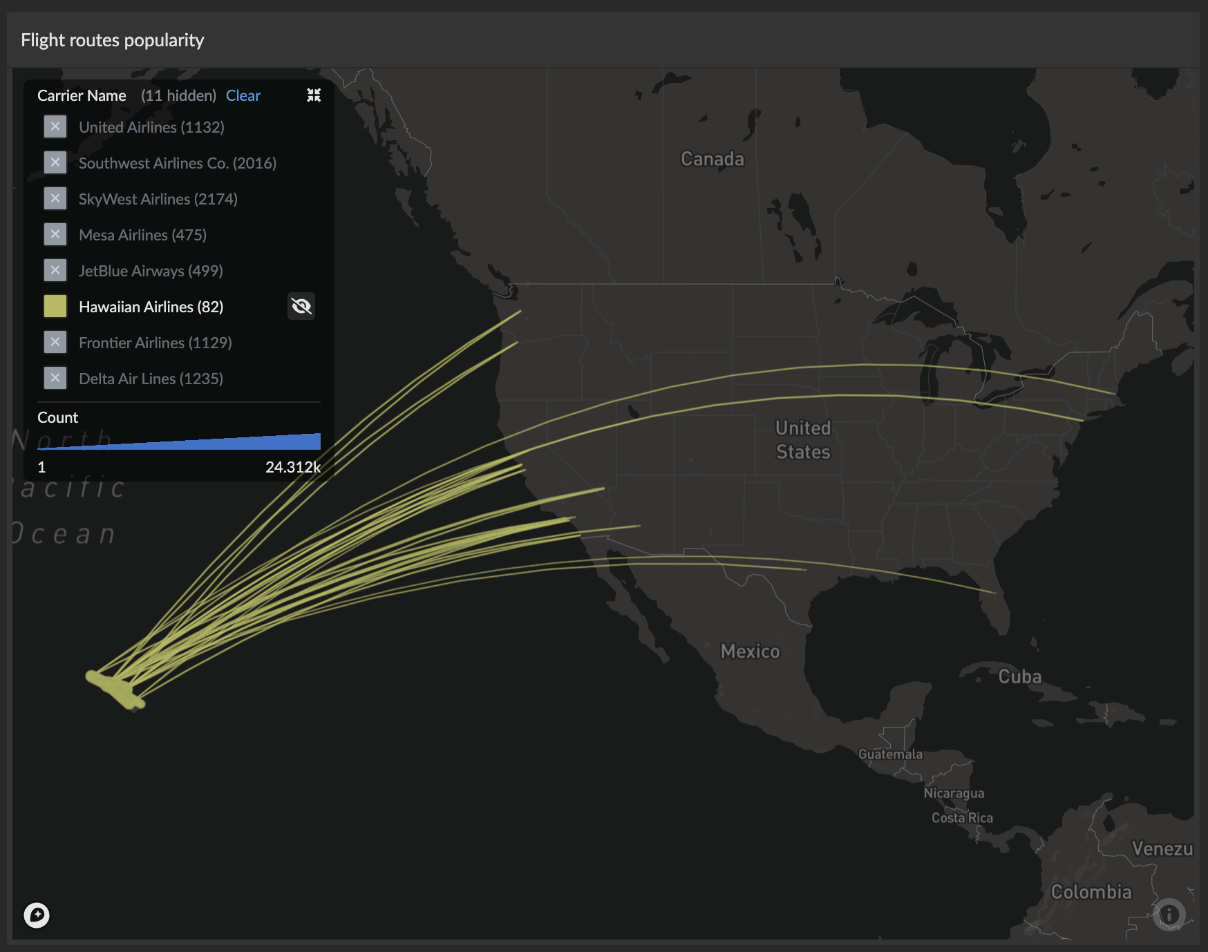
Legend Interactions
The categorical legend provides powerful filtering capabilities:
- Click to toggle: Hide/show specific categorical values on the map
- Alt+click to focus: Show only the selected category and hide all others
- Hover highlighting: Category names become bold when hovering over corresponding map features
- Multi-column layout: Automatically optimizes layout based on label length and count
- Item counts: Shows the number of data points for each category (e.g., "USA (45)")

Hover Features
- Real-time highlighting: Hover over map features to highlight corresponding legend entries
- Rich tooltips: Display all column values with proper formatting
- Cross-highlighting: Legend entries highlight when hovering over related map features
Configuration
Basic Settings
A map chart offers 3 built-in visualizations: Light, Streets and Satellite. Choose an option that is both visually appealing and complements the information shown on the map.


- Interactive: Enable or disable the interactive features
- Show zoom controls: Add an additional UI control for navigating interactive maps
- Balloon: Show all column values (other than coordinates) in tooltips on hover
- Include Lat/Lon: Additionally include the latitude and longitude information in tooltips


Map Types
The map chart supports 3 map types suited to different result data. See the Map Types and Data Requirements section above for detailed information on data formats for each type.


Points (Default)
Works with result data where each row contains coordinates for a single geographical location (latitude and longitude). Each row's location is visualized on the map in circles of different sizes and colors.
Data: Requires 2 coordinate columns (latitude, longitude). See Points/Heatmaps data requirements for details.


Lines
Requires coordinates for two geographical locations in each result row (4 columns total: origin lat/lon and destination lat/lon). These locations are then visualized by a line or arc (curved line) connecting the two locations.
Data: Requires 4 coordinate columns (origin latitude, origin longitude, destination latitude, destination longitude). See Lines data requirements for details.


GeoJSON
Can be used with result data that has columns with GeoJSON encoded values for complex geographical shapes and boundaries. Supports various geometry types including Polygon, MultiPolygon, LineString, and Point.
Data: Requires 1 column with valid GeoJSON Feature or Geometry objects. See GeoJSON data requirements for details and supported geometry types.

Data-driven Sizes
The map chart can vary the size of visualized elements (points, lines, or shapes) based on a numeric column from your data. This allows you to represent an additional dimension of information beyond position and color.


Size Column Selection:
- Choose any numeric column from your query results
- Larger values result in larger visualizations
- Works across all map types (Points, Lines, and GeoJSON)
Use Cases:
- Points: Circle radius represents population, sales volume, or other metrics
- Lines: Line thickness represents traffic volume, connection strength, or frequency
- GeoJSON: Shape border width or fill opacity can scale with data values
Configuration Options: The size mapping can be fine-tuned in the Advanced Options section, where you can set:
- Minimum size: Smallest visualization size for the minimum data value
- Maximum size: Largest visualization size for the maximum data value
- Size scaling: Linear or logarithmic scaling options
Data-driven Colors (Continuous)
Use continuous colors when your color column contains numeric data (integers, floats, decimals). Colors are smoothly interpolated across a range, creating a gradient effect that represents the magnitude of values. This allows you to visualize an additional data dimension through color intensity or hue.

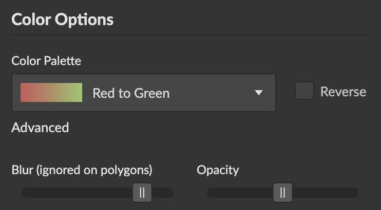
Configuration Options:
- Color Range: Choose from predefined color schemes (sequential, diverging, or custom gradients)
- Min/Mid/Max Colors: Customize specific color points for precise control
- Set minimum value color (e.g., light blue for low values)
- Set midpoint color (optional, useful for diverging scales)
- Set maximum value color (e.g., dark red for high values)
- Value Ranges: Define custom minimum and maximum bounds for color mapping
- Values below minimum: Use minimum color
- Values above maximum: Use maximum color
- Automatic: Use actual data range
Use Cases:
- Temperature maps (cold to hot colors)
- Population density (light to dark intensity)
- Sales performance (diverging scale from below to above target)
- Risk scores (green to yellow to red gradient)
Data-driven Colors (Categorical)
Use categorical colors when your color column contains text, strings, or discrete values (like country names, product categories, or status labels). Each unique value is assigned a distinct color, making it easy to distinguish between different categories. This creates an interactive legend for filtering and exploring your data.


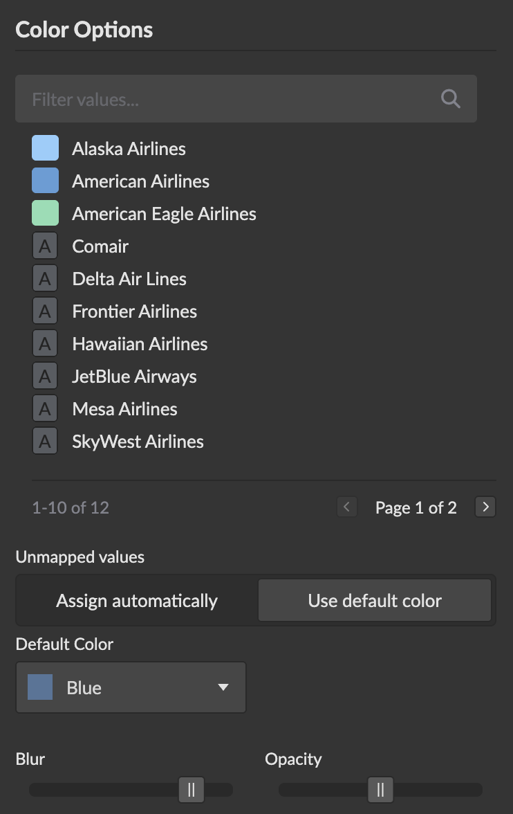
Configuration Options:
- Color Scheme: Choose from predefined categorical color palettes
- Custom Colors: Assign specific colors to individual category values
- Legend Display: Interactive legend showing all categories with item counts
- Click to toggle category visibility
- Alt+click to focus on a single category
- Hover highlighting between map and legend
Use Cases:
- Regions by country or state
- Store locations by brand or franchise
- Customer segments or demographics
- Product types or service categories
- Political boundaries by party affiliation
Unmapped Values Behavior
Configure how values without explicit color mappings are handled:
-
Assign automatically (Default): Unmapped values receive auto-generated colors from the color scheme
- Ensures every category is visible and distinguishable
- Colors are drawn from the selected palette
- Best for exploratory analysis or dynamic data
-
Use default color: Unmapped values use a single default color, grouped under "Other" in the legend
- Reduces visual clutter when there are many rare categories
- Highlights only explicitly mapped categories
- Best for focused analysis with known important categories
When "Use default color" is selected:
- A default color picker appears for customization
- The legend shows an "Other" category for unmapped values
- "Other" category supports the same interaction patterns (toggle/focus)
- Item count shows the total number of unmapped data points
Advanced Options
Various options exist for fine-tuning the map chart's zoom behavior as well as size and color of the locations in relation to the magnitude of the respective column values. The effects of changes to these options are immediately visualized in the chart shown in the report editor.


- Zoom Settings: Control initial zoom level and boundaries
- Size Options: Fine-tune minimum and maximum sizes for better visual balance
- Color Options: Adjust color intensity and ranges for optimal contrast
Best Practices
Data Optimization
- Coordinate Precision: Use appropriate precision for your zoom level (e.g., 2-4 decimal places for city-level data)
- Category Management: Limit categorical values to maintain legend readability (consider grouping rare values)
- Performance: For large datasets, consider aggregating data at appropriate geographic levels
Visual Design
- Color Selection: Choose colors that provide good contrast against your selected map style
- Size Scaling: Use size mapping judiciously to avoid overlapping points that obscure the map
- Legend Positioning: Position legends to avoid covering important geographic areas
User Experience
- Tooltip Content: Include meaningful information in tooltips while keeping them concise
- Interactive Features: Enable zoom controls for users who may not be familiar with mouse/keyboard shortcuts
- Category Naming: Use clear, descriptive names for categorical values to improve legend usability