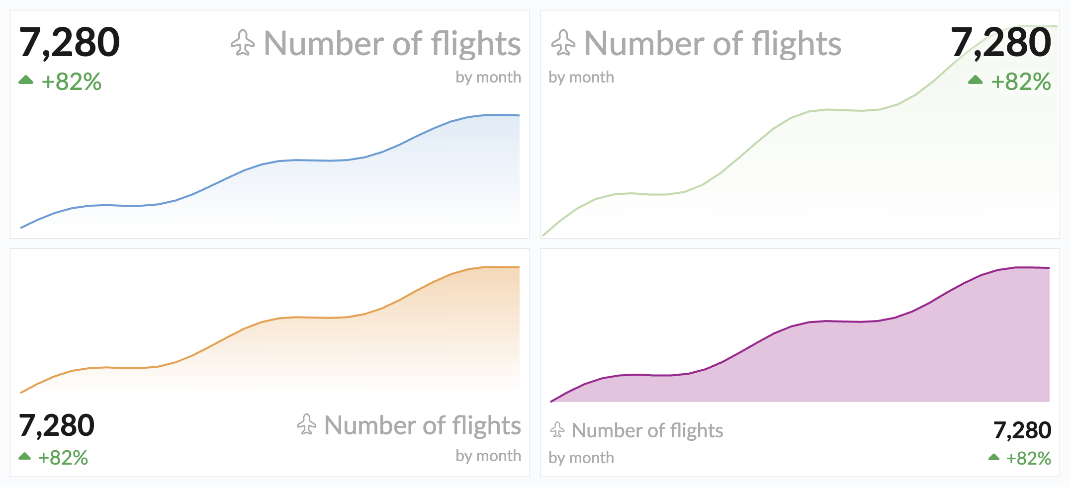
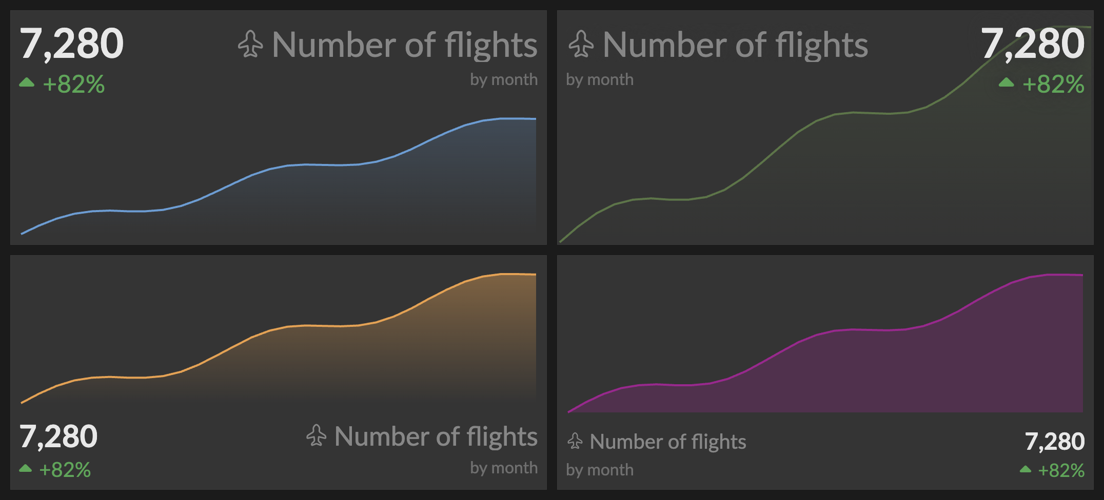
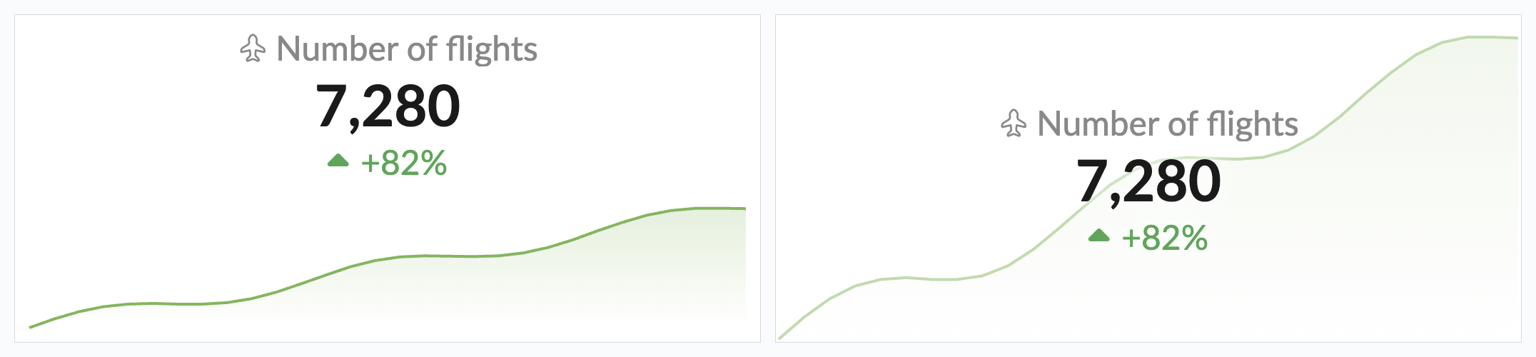
Sparkline Metric Chart
The Sparkline Metric chart combines a prominent "big number" metric with a sparkline visualization, showing both the current value and its trend over time at a glance. It fills the gap between the Number Chart (single value with optional delta) and the Line Chart (full time series).
Data Requirements
The Sparkline Metric chart is available for query results with 1 or 2 columns, for any number of rows. It is automatically suggested when the result has 3 or more rows. The sparkline and delta appear only when there are 2 or more rows — with a single row, the chart is a metric-only display (no sparkline, no delta).
The columns are interpreted as follows:
- 1 column (numeric): Values only. The sparkline x-axis uses the row index.
- 2 columns, timestamp + numeric: The first (temporal) column provides the sparkline x-axis timestamps and the second (numeric) column provides the values. The temporal column must come first.
- 2 columns, both numeric: The second column is used as the value and the x-axis falls back to the row index (no timestamps).
For example, a query like:
SELECT {created_at:day}, count(*)
FROM events
GROUP BY 1
ORDER BY 1
displays the last value as the big number, the sparkline showing all values as a line chart, and an optional delta showing the change between the last two values, or between the first and last value.
Interactive Features
Tooltip
Hovering over the metric shows a tooltip. When a delta is shown (2+ rows and Show Delta enabled), it lists:
- Current value: The last value in the series
- First or Previous value: Depending on the delta mode
- Change: The absolute delta with percentage
With a single row, or when Show Delta is off, the tooltip shows just the current Value. When copying is available (and no drill-down is configured), the tooltip also shows a Click to copy hint.
When Show Sparkline Tooltip is enabled, hovering over the sparkline shows the date/time and value at each data point.
Click to Copy
When no drill-down is configured, clicking the metric copies its values to the clipboard: the current value always, plus the previous value and delta when a delta is shown.
Drill-Down
When a drill-down is configured, clicking the metric either:
- Navigates to the target dashboard with the configured filter values, or
- Applies the filters to the current dashboard when no target dashboard is set — acting as an interactive filter control.
The hover effect shows a subtle scale animation with a colored underline. A configured drill-down replaces the click-to-copy behavior.
Configuration
The chart is configured in the report editor. A toolbar above the chart preview provides quick controls:
- S, M, L, XL: Preset sizes for the metric value and related text (default L). Text scales down responsively in narrow tiles, clamped to the S size.
- Show Title: Toggle the title display (default on).
- Show Sparkline Tooltip: Toggle the sparkline hover tooltip (default on; hidden when the sparkline is shown behind the value).
The remaining options live in the Settings, Drill-Down, and Conditional Format tabs.
Title & Position
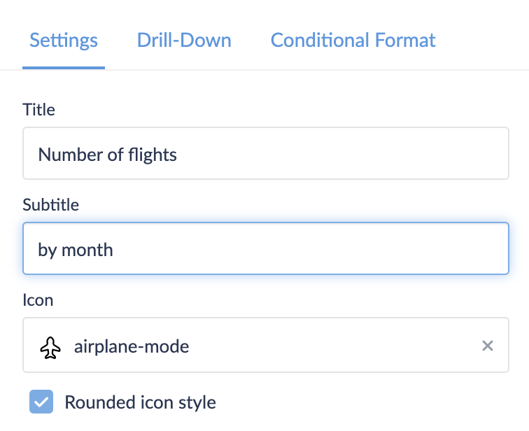
- Title: Custom title for the metric (defaults to the column name). Shown only when Show Title is on.
- Subtitle: Optional secondary text shown on the delta row. Available only when Title on opposite side is enabled.
- Icon: Optional icon displayed next to the title, chosen from over 5,500 icons. Search by name and pick an icon style — stroke, solid, duotone, twotone, or bulk (in rounded, standard, or sharp variants where available; default stroke rounded).
- Position: Where the metric sits relative to the sparkline. 8 positions are available (Top Left, Top Center, Top Right, Left, Right, Bottom Left, Bottom Center, Bottom Right), plus Center when the sparkline is behind the value (default Top Center). The Left and Right positions place the sparkline beside the metric; Top and Bottom positions stack them vertically.
- Title on opposite side: Places the title on the opposite side of the metric value on the same row, with an optional subtitle on the delta row. Available only for left- or right-aligned positions, not when centered.
The icon picker — search across 5,500+ built-in icons and choose a style.
Choosing an icon style — each option previews the selected icon in that style (stroke, solid, duotone, twotone, and bulk, in rounded, standard, and sharp variants where available).
Values
- Value Column: Which numeric column provides the metric value and sparkline data.
- Sparkline Timestamps Column: Which temporal column provides the x-axis timestamps. Select None to use the row index.
Values Formatting
Standard value formatting options: number, money, or bytes format, with abbreviation, precision, rounding, and currency settings.
Sparkline
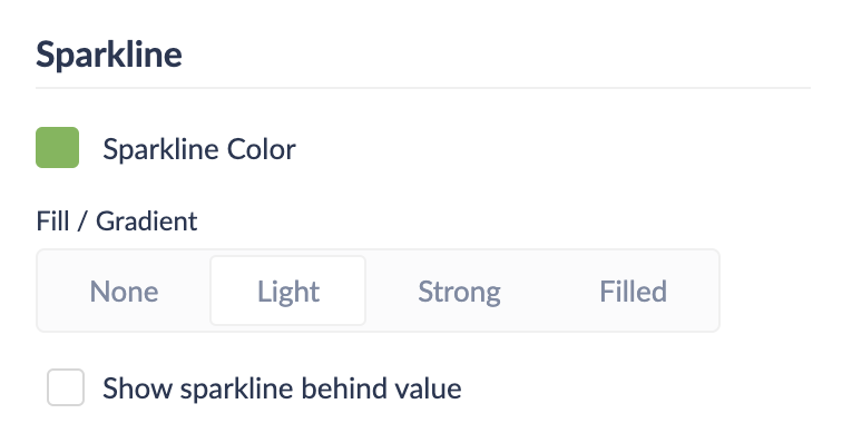
- Sparkline Color: The color of the sparkline line and gradient fill. As with other charts, it can use a color from the dashboard color scheme or a custom hex color (default: the first color of the dashboard color scheme).
- Fill / Gradient: Controls the area fill under the sparkline line:
- None: Line only, no fill
- Light: Subtle gradient from 30% opacity to transparent (default)
- Strong: Visible gradient from 60% opacity to transparent
- Filled: Solid 40% opacity fill
- Show sparkline behind value: When enabled, the sparkline fills the entire background with the metric overlaid on top. The sparkline renders at reduced opacity with a text shadow for legibility.
Delta
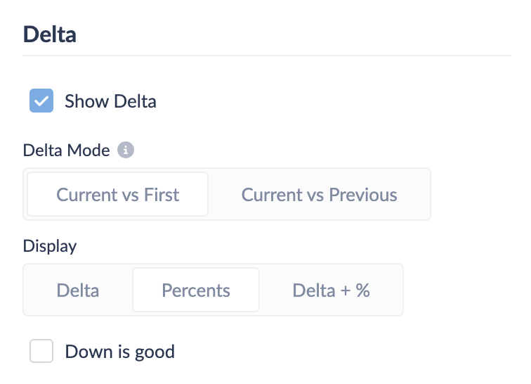
- Show Delta: Toggle the delta indicator below the metric value (default on). Shown only when there are 2+ rows.
- Delta Mode: How to calculate the delta:
- Current vs First: Compares the last value to the first value in the series (default)
- Current vs Previous: Compares the last value to the second-to-last value
- Display: How to show the delta value:
- Delta: Absolute value only (e.g.,
+465) - Percents: Percentage only (e.g.,
+37.3%) - Delta + %: Both (e.g.,
+465 (+37.3%)) (default)
- Delta: Absolute value only (e.g.,
- Down is good: Inverts the delta colors (green for a decrease, red for an increase).
A positive delta shows green with an up caret, a negative delta shows red with a down caret, and a zero change shows neutral gray with a right caret (regardless of Down is good). When the baseline value is zero, the percentage is omitted (division by zero) and only the absolute delta is shown.
Drill-Down
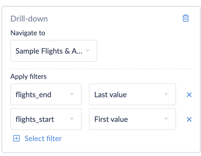
Configure a drill-down action with semantic value options:
- Last value: The current metric value (always available)
- First value: The first value in the series (requires 2+ rows)
- Previous value: The second-to-last value (requires 2+ rows)
- Delta: The computed difference (requires 2+ rows)
- Timerange: The time range spanned by the data (requires a timestamp column). Formatted as
unix~unixfor the standard timerange filter, or as ISO timestamps (ISO~ISO) for custom date-range filters.
Conditional Formatting
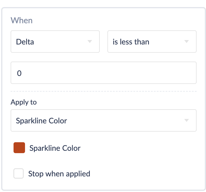
Apply formatting rules based on conditions:
- When: Value, Delta, or Delta Percent
- Apply to: Value, Delta, or Sparkline Color — selecting Sparkline Color shows a color picker that recolors the sparkline when the rule matches.
- For Value and Delta, supports all standard style types: preset colors, custom styles, CSS, text prefix/suffix/replace, and icons. Thresholds use plain numeric values.
Examples
A daily revenue metric with its recent trend:
SELECT
  date_trunc('day', created_at) AS day,
  sum(amount) AS revenue
FROM orders
WHERE {timerange:created_at}
GROUP BY 1
ORDER BY 1
This returns one row per day — a timestamp column followed by a numeric value. The chart shows the most recent day's revenue as the big number, a sparkline of the daily trend, and a delta comparing the latest value to the baseline. Useful configuration for this case:
- Delta Mode: Current vs Previous for day-over-day change, or Current vs First for the trend across the whole range.
- Show sparkline behind value with the Center position for a compact KPI tile.
- A Conditional Formatting rule on Delta applied to Sparkline Color to turn the sparkline red when revenue drops.
Best Practices
Query Design:
- Order chronologically:
ORDER BYthe timestamp ascending so the last row is the current value and the delta compares the correct endpoints. - One row per period: Aggregate to a single row per time bucket (day, week, month) so the sparkline reflects an even series.
- Return 3+ rows: A meaningful trend needs several points; the chart is auto-suggested at 3 or more rows.
Configuration:
- Match the delta mode to the question: Use Current vs Previous for period-over-period change, Current vs First for cumulative trend.
- Use "Show sparkline behind value" for compact KPI tiles where the trend is context rather than the focus.
- Enable "Down is good" for metrics where a decrease is positive (e.g., churn, cost, latency).
Performance:
- Pre-aggregate long histories in SQL rather than returning thousands of rows; the sparkline only needs enough points to show the shape.
- Bound the query with a
{timerange}filter so the series stays proportional to the dashboard's selected period.